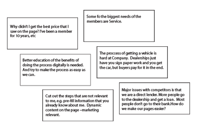
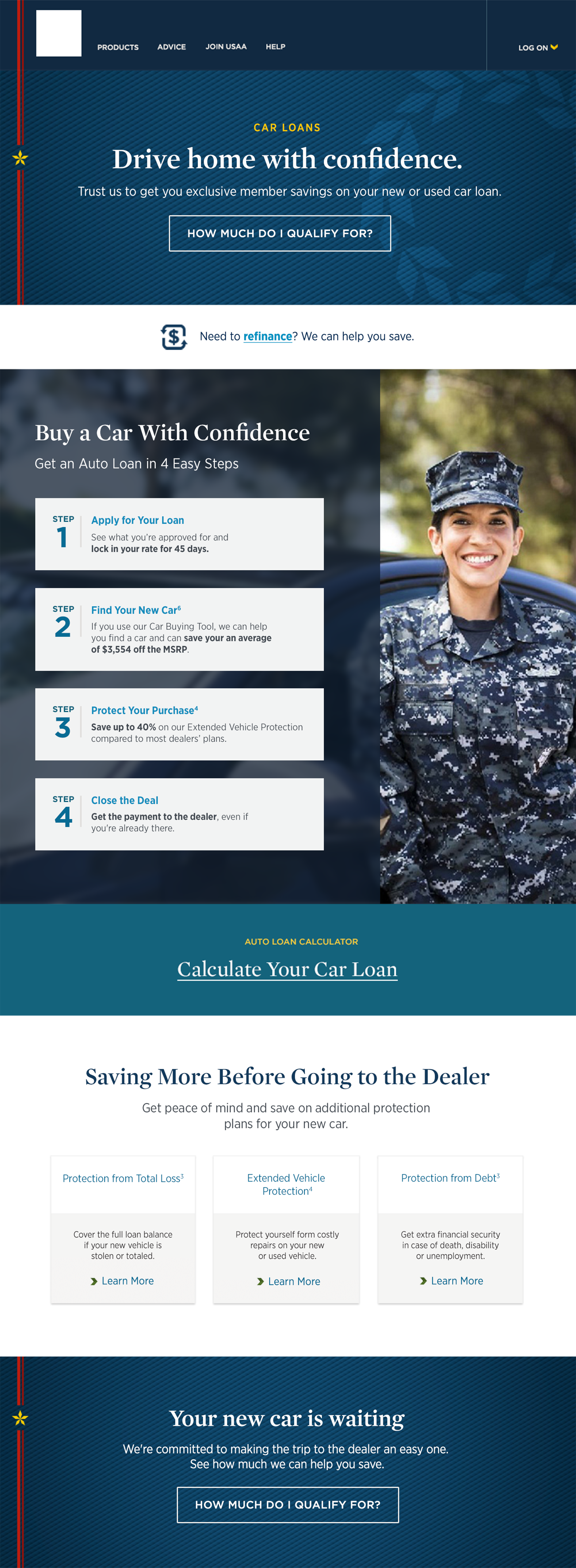
Auto Loan Redesign

Featured Work UX/UI

  • Auto Loan Redesign

The Challenge

The Auto Loan experience was seeing significant drop off rates in product acquisition. Membership would start applications but not finish them and a consider amount of people were finding that there was too much information on the current shopping page to make comfortable and informed decisions. This was causing a feeling of being overwhelmed with an already stress full process.

We need to figure out what was causing this overwhelming feeling for membership and what was going to be the right amount of information that would help them feel confident in starting their applications for an auto loan.

User Insights

The Research

To better understand our user base, we conducted multiple user interviews, data collection and analysis, stakeholder interviews, persona creations and journey mapping.


Auto Loan Journey Map

The User Journey

In the users journey map, we found that one of the most stressful times for consumers was rate shopping.

Users expressed that they want upfront rates and to know what are the benefits when getting a new or used auto loan.


"Make sure it is a simple, easy process to apply for a loan. Easy to find the loan. Easy to apply. Good rates."

Auto Loan Journey Map

Sketches and Wireframes

Base on the user data and stakeholder goals, we created a few concepts around highlighting rates, product features and loan calculators.


"Members want to see a holistic view of the steps. Keep member informed during the process "

Auto Loan Wireframe

The Layout

We created three different variations of the auto loan product page, focusing on highlighting auto rates for new and used car loans and displaying a multitude of product features that give us more of a competitive edge.

We also wanted to create other options that created a sense of one stop for all your rate needs and another option that centered around how we differ in the application process.